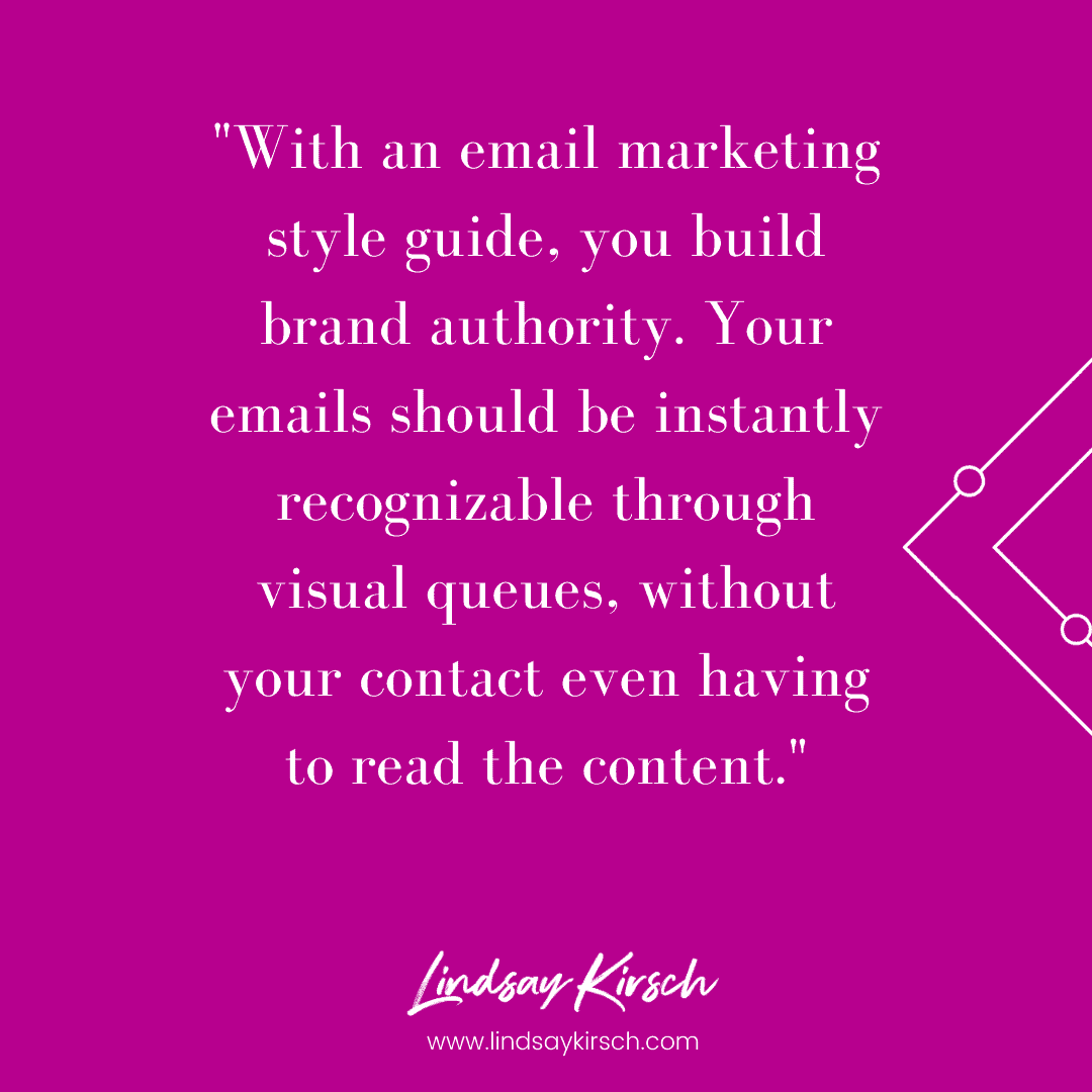
Consistent email design can be achieved simply by creating custom templates in advance. With an email marketing style guide, you build brand authority. Your emails should be instantly recognizable through visual queues, without your contact even having to read the content.
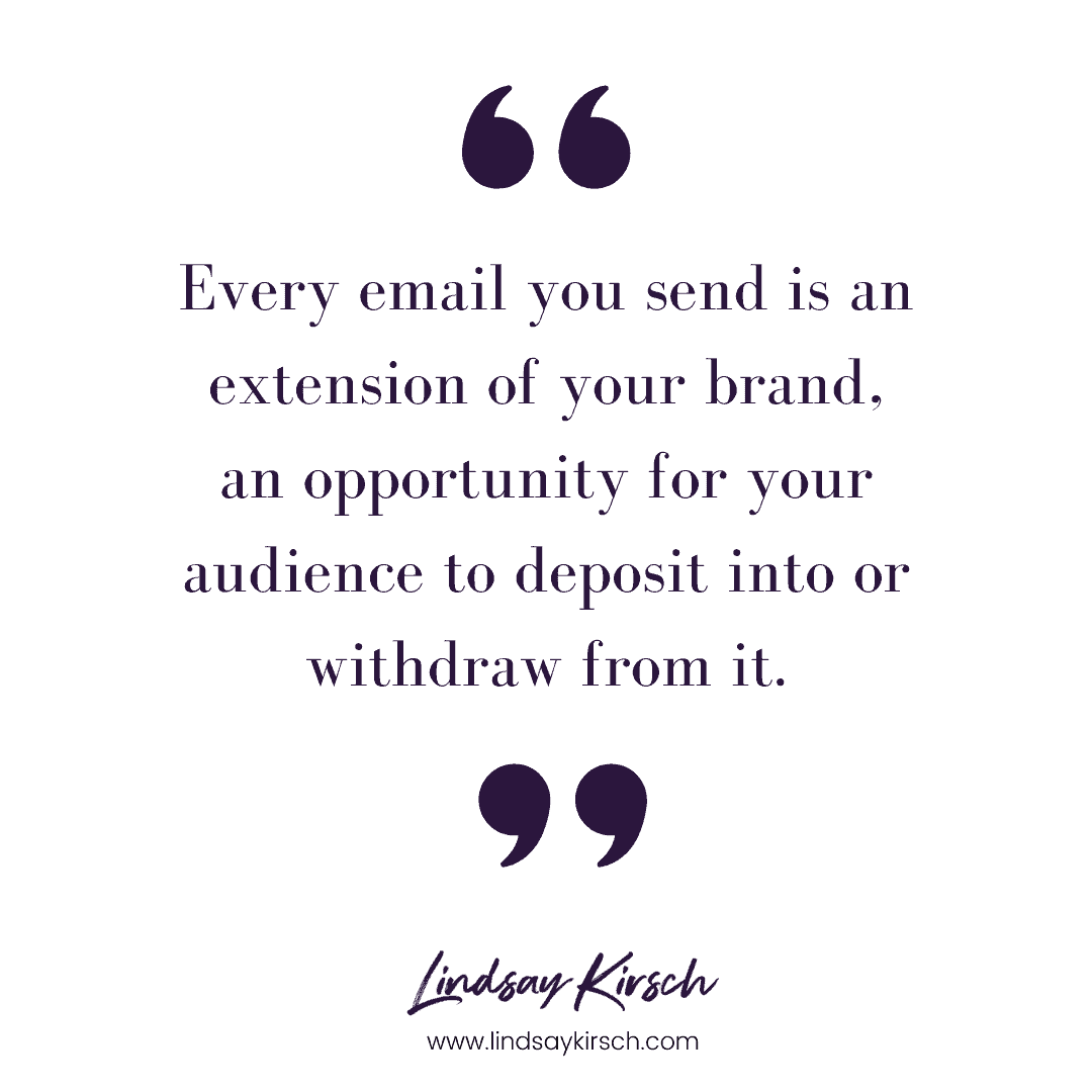
It is so important to think of all your marketing sources as an extension of your brand, both in content and visuals. Every email you send is an extension of your brand, an opportunity for your audience to deposit into or withdraw from it.
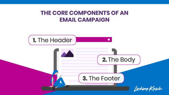
The key components to an email marketing style guide are the header, body, and footer. By unifying these components under a single visual identity, you make it easier for your email subscribers to connect with your brand and move through their customer journey.
Email marketing is your most powerful source of communication with your audience. Messy, confusing emails will never clearly impart your brand’s message. Unclear communication can have problematic outcomes – it could result in contacts unsubscribing, or disengaging entirely.
The Email Style Guide Core Components
The Header
First impressions last the longest, so make yours count.
When creating your email marketing style guide, it is important to remember that your message is communicated through the layout as much as the content.
Let’s start at the top. The header – the introduction to your email.
Headers are totally optional, but are a really great way to set the expectations for the email. That way, your subscriber knows exactly what they are going to get out of this email experience.
I find it really useful to divide my contacts into lists through ActiveCampaign. That way, I can target my header for a specific group, like a members-only communication or a special offer.
A standard header style helps to keep your emails clear and consistent and lays out the expectations for the content within the email. This will help you to build that relationship between you and your audience – they will know that what they see is what they will get.
The Body
If the header is where you set the expectations for your email, the body fulfills them. It is so important that your emails follow through on what your audience expects to receive.
The body is where your email marketing style guide comes in very handy for automating layouts. By incorporating consistent colors, fonts, spacing, and link utilization in a basic template, you build on the visual brand identity your audience recognizes from other platforms. You can then adjust these elements as is necessary for the purpose of this particular email.
It is always a good idea to leverage the same elements you use on your website within your email. However, it is important to note that you make sure any fonts you use are supported within whichever email tool you use.
Color is so important for any visual medium, so take the time to consider the color standard for links or buttons within your email. The right eye-catching color increases the visibility of your call-to-action, which can lead to more conversions.
In general, the standard color for links and buttons is blue. Your email tool will allow you to customize this to a color that complements your brand. While contrasting colors can be a fun way to catch your reader’s eye, any color within your brand’s color scheme will work.
Whatever adjustments you make for your template, make sure you note it in your email marketing style guide. That way, your emails will maintain a consistent look and feel, whether you make them yourself, or choose to outsource.
The Footer
This is your chance to round off your email and remind your audience that there is a person sitting at the other end of the internet.
People like connecting with people, so this is a great opportunity to humanize your brand. I like to include a name, title, and maybe even a small photo of the person who is sending the email. This reminds your audience that the email is coming from another person, not a robot.
A fun addition to your footer is a gif – it will definitely set you apart from the crowd. Whether you decide to use a gif or an image to close your email, it is again important to stipulate sizing and resolutions in your email marketing style guide.
Other Considerations
Successful brands take the time to carry their aesthetic across all their platforms. Keeping colors consistent between your website and email template, and carrying that across all other platforms triggers visual recognition in your audience.
It’s also a great idea to integrate subscription management into your email marketing style guide. Knowing who is receiving the email will help you determine the content of your email, and adjust the visuals to focus on what they are expecting to get out of the correspondence.
Predictive sending is another great tool to utilize as part of your style guide. Using machine learning, you can determine the best time to send an email to your audience to increase open rates. With this information, you can adjust your email marketing style guide to best fit the date and time that the email will be sent out.
An email marketing style guide will give you a template for your emails, saving you time and effort when you set up automations. Do you have an email style guide? I’d love to hear what’s working for your brand in the comments below!